A Flutter package for creating synchronized PageViews with bidirectional scrolling sync. Perfect for creating interfaces where two PageViews need to stay in sync, such as main content with thumbnails, tabs with content, or any dual-pane scrolling interface.
- 🔄 Bidirectional Sync: Scrolling one PageView automatically syncs the other
- 🎯 Tap Navigation: Support for tapping to navigate between pages
- ⚙️ Highly Customizable: Custom viewport fractions, animation curves, and builders
- 🔧 No External Dependencies: Built with pure Flutter, no additional packages required
- 🎨 Custom Builders: Override default PageView builders for complete control
- � Flexible Layouts: Choose between Stack, Column, or Row layouts
- �📱 Responsive: Works with different screen sizes and orientations
Add this to your package's pubspec.yaml file:
dependencies: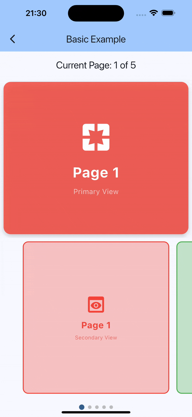
synced_page_views: ^1.0.0import 'package:flutter/material.dart';
import 'package:synced_page_views/synced_page_views.dart';
class BasicExample extends StatefulWidget {
const BasicExample({super.key});
@override
State<BasicExample> createState() => _BasicExampleState();
}
class _BasicExampleState extends State<BasicExample> {
int _currentPage = 0;
final List<Color> _colors = [
Colors.red,
Colors.green,
Colors.blue,
Colors.orange,
Colors.purple,
];
@override
Widget build(BuildContext context) {
return Scaffold(
appBar: AppBar(
title: const Text('Synced PageViews'),
),
body: SyncedPageViews(
itemCount: _colors.length,
primaryItemBuilder: (context, index) {
return Container(
color: _colors[index],
child: Center(
child: Text(
'Page ${index + 1}',
style: const TextStyle(color: Colors.white, fontSize: 32),
),
),
);
},
secondaryItemBuilder: (context, index) {
return Container(
margin: const EdgeInsets.all(4),
decoration: BoxDecoration(
color: _colors[index],
borderRadius: BorderRadius.circular(8),
),
child: Center(
child: Text(
'${index + 1}',
style: const TextStyle(color: Colors.white),
),
),
);
},
primaryViewportFraction: 1.0,
secondaryViewportFraction: 0.3,
layoutBuilder: (primary, secondary) => Column(
children: [
Expanded(child: primary),
SizedBox(height: 100, child: secondary),
],
),
onPageChanged: (index) {
setState(() {
_currentPage = index;
});
},
),
);
}
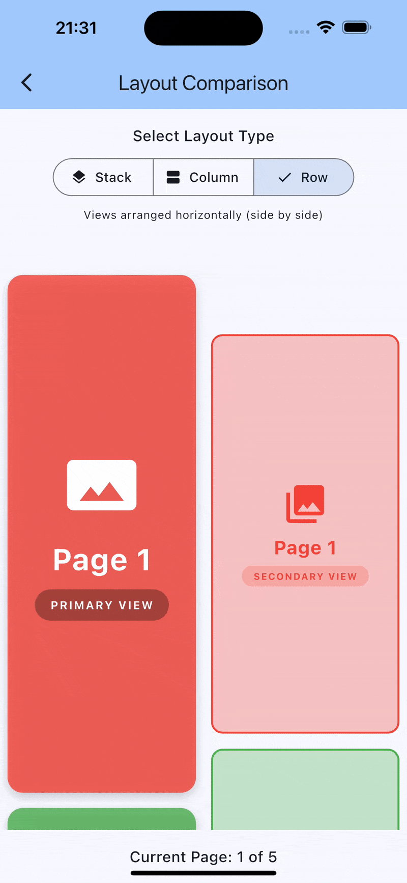
}The package supports flexible layouts using the layoutBuilder parameter:
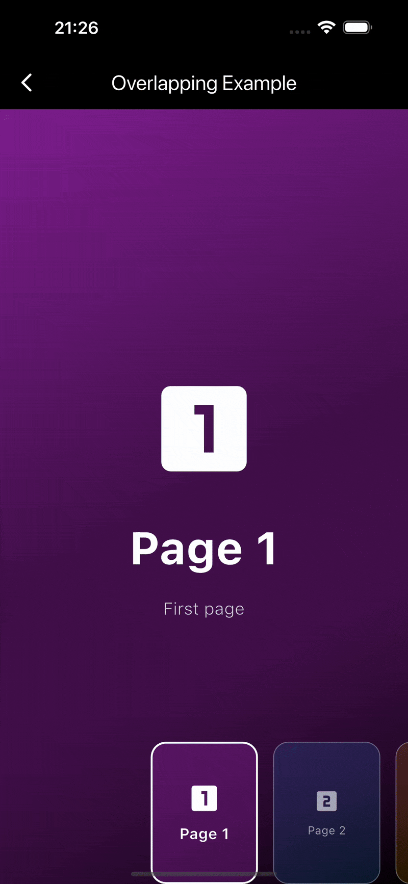
Views overlap each other - perfect for overlays like iOS camera interface:
SyncedPageViews(
  itemCount: 5,
  primaryItemBuilder: (context, index) => YourPrimaryWidget(index),
  secondaryItemBuilder: (context, index) => YourSecondaryWidget(index),
  layoutBuilder: (primary, secondary) => Stack(
    children: [
      primary,
      Align(
        alignment: Alignment.bottomCenter,
        child: SizedBox(height: 150, child: secondary),
      ),
    ],
  ),
)Views arranged vertically - ideal for main content with bottom navigation:
SyncedPageViews(
  itemCount: 5,
  primaryItemBuilder: (context, index) => YourPrimaryWidget(index),
  secondaryItemBuilder: (context, index) => YourSecondaryWidget(index),
  layoutBuilder: (primary, secondary) => Column(
    children: [
      Expanded(child: primary),
      Expanded(child: secondary),
    ],
  ),
)Views arranged horizontally - perfect for side-by-side comparisons:
SyncedPageViews(
  itemCount: 5,
  primaryItemBuilder: (context, index) => YourPrimaryWidget(index),
  secondaryItemBuilder: (context, index) => YourSecondaryWidget(index),
  config: const SyncedPageViewsConfig(
    scrollDirection: Axis.vertical, // Important for row layout
  ),
  layoutBuilder: (primary, secondary) => Row(
    children: [
      Expanded(child: primary),
      Expanded(child: secondary),
    ],
  ),
)For maximum control, you can create and manage a SyncedPageController yourself:
class CustomExample extends StatefulWidget {
  const CustomExample({super.key});

  @override
  State<CustomExample> createState() => _CustomExampleState();
}

class _CustomExampleState extends State<CustomExample> {
  late final SyncedPageController _controller;

  @override
  void initState() {
    super.initState();
    _controller = SyncedPageController(
      initialPage: 0,
      primaryViewportFraction: 1.0,
      secondaryViewportFraction: 0.3,
    );
  }

  @override
  void dispose() {
    _controller.dispose();
    super.dispose();
  }

  @override
  Widget build(BuildContext context) {
    return Scaffold(
      body: SyncedPageViews(
        controller: _controller,  // Pass your own controller
        itemCount: 5,
        primaryItemBuilder: (context, index) => YourPrimaryWidget(index),
        secondaryItemBuilder: (context, index) => YourSecondaryWidget(index),
        onSecondaryPageTap: (index) {
          // Use the controller to navigate
          _controller.animateToPage(
            index,
            duration: const Duration(milliseconds: 300),
            curve: Curves.easeOut,
          );
        },
      ),
      floatingActionButton: FloatingActionButton(
        onPressed: () {
          // Programmatically navigate
          _controller.animateToPage(
            (_controller.currentPageIndex + 1) % 5,
            duration: const Duration(milliseconds: 300),
            curve: Curves.easeInOut,
          );
        },
        child: const Icon(Icons.arrow_forward),
      ),
    );
  }
}SyncedPageViews(
itemCount: 10,
primaryItemBuilder: (context, index) => MyContentPage(index),
secondaryItemBuilder: (context, index) => MyThumbnail(index),
initialPage: 0,
primaryViewportFraction: 0.9,
secondaryViewportFraction: 0.7,
config: const SyncedPageViewsConfig(
animationDuration: Duration(milliseconds: 500),
animationCurve: Curves.elasticOut,
scrollDirection: Axis.horizontal,
pageSnapping: true,
reverse: false,
),
layoutBuilder: (primary, secondary) => Stack(
children: [
primary,
Positioned(
bottom: 20,
left: 0,
right: 0,
height: 120,
child: secondary,
),
],
),
onPageChanged: (index) {
print('Page changed to: $index');
},
onPrimaryPageTap: (index) {
print('Primary page $index tapped');
},
onSecondaryPageTap: (index) {
print('Secondary page $index tapped');
},
)| Property | Type | Description |
|---|---|---|
itemCount |
int |
Number of pages (required) |
primaryItemBuilder |
Widget Function(BuildContext, int) |
Builder for primary pages (required) |
secondaryItemBuilder |
Widget Function(BuildContext, int) |
Builder for secondary pages (required) |
controller |
SyncedPageController? |
Optional external controller |
initialPage |
int |
Initial page index (default: 0) |
primaryViewportFraction |
double |
Viewport fraction for primary PageView (default: 1.0) |
secondaryViewportFraction |
double |
Viewport fraction for secondary PageView (default: 1.0) |
config |
SyncedPageViewsConfig? |
Configuration for animations and behavior |
layoutBuilder |
Widget Function(Widget, Widget)? |
Custom layout builder (default: Stack) |
onPageChanged |
void Function(int)? |
Callback when page changes |
onPrimaryPageTap |
void Function(int)? |
Callback when primary page is tapped |
onSecondaryPageTap |
void Function(int)? |
Callback when secondary page is tapped |
| Property | Type | Description |
|---|---|---|
animationDuration |
Duration |
Animation duration (default: 300ms) |
animationCurve |
Curve |
Animation curve (default: Curves.easeInOut) |
scrollDirection |
Axis |
Scroll direction (default: Axis.horizontal) |
pageSnapping |
bool |
Enable page snapping (default: true) |
reverse |
bool |
Reverse page order (default: false) |
physics |
ScrollPhysics? |
Custom scroll physics |
For advanced use cases, SyncedPageController provides direct access to synchronized PageControllers:
| Property/Method | Type | Description |
|---|---|---|
primaryController |
PageController |
The primary PageController |
secondaryController |
PageController |
The secondary PageController |
currentPageNotifier |
ValueNotifier<int> |
Current page notifier |
currentPageIndex |
int |
Current page index getter |
animateToPage(int, {Duration?, Curve?}) |
Future<void> |
Animate to specific page |
jumpToPage(int) |
void |
Jump to specific page without animation |
- Video/Media Players: Main video with thumbnail navigation
- Image Galleries: Full-size images with thumbnail strip
- Tabbed Interfaces: Tab headers synced with content pages
- Product Showcases: Product images with detail thumbnails
- Tutorial/Onboarding: Steps with progress indicators
Contributions are welcome! Please feel free to submit a Pull Request.
This project is licensed under the MIT License - see the LICENSE file for details.